The UMSL logotype, department logotypes, the trident and the wordmark each support the university in different ways. Used consistently, these elements create and maintain a connection with the UMSL brand in the minds of university audiences.
UMSL Logotype Policies and Downloads
UMSL Logotype
The UMSL Logotype is the core of the university’s brand identity. Use of the UMSL logotype is required on all printed and electronically displayed materials to visually reinforce the identity of the university.
Consistent use of the logo strengthens recognition for UMSL and maintains a unified brand. Unique logos for academic, administrative or research units undermine this effort and are not permitted, without exception.
The horizontal University logo is the preferred first choice. When appropriate, it may be substituted with the vertical University logo.
![]()
Horizontal Logo
 Vertical Logo
Download Logos
The links below enable you to download ZIP files for each approved version of the logotype. Each ZIP file contains png logo files, for both the horizontal and vertical logotypes. If you need another file type, please reach out to Traci Moore at tracimoore@umsl.edu.
To open a zip file, double click the downloaded zip file then move the files into a folder or on your desktop.
If you need a department specific UMSL logo, you can download it from the repository.
Logo Guidelines
Color options and acceptable contrast
The preferred treatment of the horizontal logo or vertical logo is Triton Red and Black over an open, white background.
If the logo must be placed on a dark background, you may use a reverse version of the logo to improve readability. The logo may be placed over a background image or pattern only if there is sufficient contrast to distinguish the logo from outside elements. White is the only color approved for use on black backgrounds.
The University logo, or University unit or department logo, must be used on all forms of printed and
electronically displayed communications, and whenever the university is being represented.
The logos must be reproduced from high-resolution digital artwork.
The logomark is built using Compacta typeface. Under no circumstances should Compacta be used when typesetting for print or digital documents.
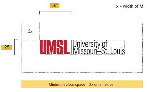
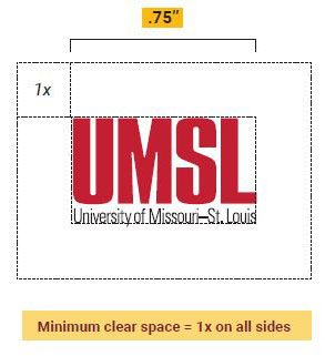
Clear space and minimum size
Clear space must surround the logo to ensure legibility and provide the greatest impact. An ample cushion of space no less than .25 inch for print or 24 pixels for webpages should border the logo. The logo should not overlap or be overlapped by type, illustrations, photos, other logos or other design elements.
In order to ensure legibility, the logomark should not appear smaller than .50 inch for the primary logo. The full width of the primary logo will vary depending on the unit, department or programs. The stacked logo should not appear smaller than .75 inch wide.
These size requirements apply to all unit and department logos.
Improper uses of the UMSL Logotype
Always use the official University of Missouri–St. Louis logo. It should never be edited, recreated, or combined with other graphic or typographic elements. Below are some examples of unacceptable usage:


Exemptions
Exemptions from policies presented here should be requested in writing.
Send exemption requests to Justin Roberts, associate vice chancellor of marketing and communications.