|
Overview
|
|
Business intelligence (BI) tools offer an
increasing array of dashboard capabilities for the presentation of data,
including diverse chart types and animations, however most BI
developers aren't experts in user interface (UI) or graphic design. This
note sets out some basic good practice when it comes to building
dashboards, and covers some common traps to avoid.
- Dashboards (a variant of reporting) can be an effective way to
deliver BI to a wide variety of users, especially those ill-served by
ungainly pages of tabulated reports.
- Dashboard design is a particular skill, requiring a strong focus on
the user's role to secure the long-term adoption of the technology.
- Irrelevant key performance indicators (KPIs) mean irrelevant
dashboards.
- Surprisingly, despite years of hyping, less than a quarter of the
firms surveyed for the 2009 Magic Quadrant for business intelligence
platforms use dashboards extensively.
- Focus on what dashboards are for; the targeted delivery of a small
group of KPIs relevant to a user's role.
- Dashboards need to be simple in form to be effective, and avoid the
more "gimmicky" features available in products (like 3D effects) as they
add no value to the delivery of information.
- Consider working with an experienced UI developer, human-computer
interaction or layout specialist as part of your dashboard development
team.
|
|
|
Analysis
|
|
The survey conducted for the 2009 "Magic
Quadrant for Business Intelligence Platforms" found that dashboards
still have a relatively low adoption in the BI user community — while
62.6% of 480 respondents were making "extensive use" of reporting
functionality, only 22.6% were doing the same for dashboards. Most firms
are just beginning to make full use of dashboard capabilities and need
advice on the fundamentals. Furthermore, where firms are using
dashboards, they're not always well developed. Some of the dashboards
that Gartner analysts see are poorly designed and so unlikely to help
users understand what the data's telling them or help them to make
better decisions. This report is intended to help implementers create
dashboards that are more consumable. It's perhaps worth reiterating our
definition of dashboards at this point: "This subset of reporting
includes the ability to publish formal, Web-based reports with intuitive
interactive displays of information, including dials, gauges, sliders,
check boxes and traffic lights. These displays indicate the status of an
item or the state of a performance metric compared with a goal or
target value. Increasingly, dashboards are used to disseminate real-time
data from operational applications." In other words, the main purpose of a
dashboard is to enable managers to quickly and routinely comprehend how
they are performing against their KPIs, not to provide an environment
for complex data analysis. Without the necessary thought, dashboards
can be built that are ill-suited to the task of delivering clear,
unambiguous management information. A dashboard should be narrow in
focus to be effective and not aim to cover too broad a dataset. A good
maxim is to keep dashboards simple — this approach is much more likely
to be useful in helping you build dashboards that are fit for purpose.
Another good reason for simplicity is to ensure adequate performance —
there is an inevitable trade-off between users wanting to see everything
on the face of the dashboard and acceptable response times when
rendering multiple graphical objects, particularly for animated
dashboards built using Flash. Based on this situation here are 12
pointers to help you deliver better, more useful dashboards:
- Dashboards and the charts, dials and gauges they contain are only
as good as the KPIs they serve up. Presenting a set of irrelevant
measures has one inevitable result — the disuse of the dashboard by the
end users and, more often that not, a return to spreadsheets as an
unregulated, but user controlled, substitute environment. Building a
mutually agreed enterprise metrics framework can address this problem.
Where possible, allow the user to add and subtract metrics from their
dashboard, based on a defined pool in the metrics framework. End-users'
needs change and perfect alignment is hard to obtain — let the final
content be in the hands of the user.
- Dashboards and the charts, dials and gauges they contain are only
as good as the data they draw on. Avoid the danger of data quality
issues being seen as a nasty surprise by using one of the visual objects
on the dashboard to deliver a data quality metric, either sourced from
data quality tools, derived during the extraction, transformation and
loading process or as supplied by the data stewards responsible. If you
do not want to use a separate gauge or dial for this, consider different
ways to indicate the quality, like using shading to indicate when the
data is stale or poor. Gartner analysts have seen this type of approach
used on flight watcher, for example where altitude, speed and position
are on the dashboard. When the telemetry is delayed, the path shown goes
from solid to dotted and the altitude/speed changes to gray.
- A dashboard that only refreshes monthly isn't really a dashboard
at all. Data must be timely, with appropriate latency. There's a big
difference between pushing a graphical report to end users via e-mail
on a monthly basis and having a portal-based dashboard which is visible
to users every day on their personal intranet home page. In the latter
case the data must be updated at least daily. If it doesn't it's just a
waste of screen real estate and will become ignored by users. Dashboards
are good at giving "status" or perspective, and in some cases the
status only updates daily as such less frequently updated dashboards can
be useful (say if there is only weekly updates), as long as there is
some means of interaction, perhaps a time slider, so users can see the
measures changed with time, with the understanding that different
metrics have different frequency — customer satisfaction data only
refreshes every month, while other metrics like sales pipeline index may
be updated during the day. However, the caution would still be not to
persist this dashboard on a user's home page, but rather distribute it
or allow them to drill to it when needed.
- Using too many dials is just more information overload. Don't
weigh your dashboard down. It's hard for humans to process lots of
information feeds at once — a basic rule of thumb is to use no more than
seven objects on a dashboard. This aligns directly with Gartner's
advice that at any given management level using seven metrics (plus or
minus two) is most optimally effective. Developers sometimes get a
little ambitious and decide to build a "cockpit" akin to that on a
Boeing 747. What they don't realize is that pilots concentrate on four
key flight instruments for the vast majority of the time and these are
arranged in the same layout on all planes (see Figure 1). This also
applies to "sparklines" (small high-resolution charts reporting one
variable in context), which are undoubtedly elegant, but when used to
excess can also add to information overload.
Figure 1.
Learning From "Real" Cockpits 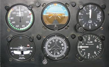
Source:
en.wikipedia.org/wiki/File:Six_flight_instruments.JPG
Dashboard designers can learn a lot from
aircraft cockpits, which are:
- Focused on real key indicators: airspeed, rate of climb, altitude,
direction and so on. Note that these are all status rather than
performance indicators — the analogy only goes so far.
- Standardized, with four key flight instruments laid out in a basic
"T" format.
- Graphically simple, with no unnecessary decoration.
- Use familiar chart formats. If your dashboard design includes
charts (as distinct from dials, gauges and traffic light indicators)
for comparison across series use concrete visual metaphors (column/bar,
line/area and maybe pie charts — see below). Managers and executives
already know how to read these and assimilate the data they contain. Use
unfamiliar, highly multidimensional chart types (x/y, heat/treemaps)
with caution — these are best used for analysts working across broad
data sets as part of exploratory interactive data visualization.
- Keep charts simple. This applies to charts themselves too,
where "less is more." The aim should be to communicate the data with as
little visual "noise" as possible. Edward Tufte, an authority on
visualization defines this as the "data to ink" ratio where "data ink"
is the essential ink (or pixels) used to present the data. You should
aim to have as high a data:ink ratio as possible in each chart, dial,
indicator or gauge too. In practical terms this means averring the use
of unnecessary decoration, chart backgrounds that add no meaning,
redundant text, filled objects (for example, colored areas) and grid
lines — anything that adds nothing to the communication of the data or
worse obscures it. However, take care not to go too far and remove
meaning; Gartner analysts see too many dashboards that have no labels
(or obscure labels), making it hard to understand what is being shown.
- Make dashboards "real." It goes without saying that the use
of geographic maps overlaid with BI data immediately resonates with
dashboard consumers. However, don't be afraid to go beyond this by using
mashup capabilities to overlay measures, variance or status flags onto
process models, building layouts, seating plans and so on, in fact any
representation that carries meaning in itself is a very powerful aid in
making the data the dashboard delivers "real" to end users by
transmitting context effectively.
- Avoid using color alone to transmit meaning. While "traffic
lights" are easily understood it should be remembered that a good
minority of people (around 10% of males) perceive colors differently.
Obviously this impacts other chart types too. Although there is a
limited pallet of "safe" colors that can be used for all viewers,
ideally a combination of color and shape or shade or position should be
used to avoid ambiguity (and falling foul of disability regulation in
some countries).
- Don't be afraid to use (small) tables. To misquote Gordon
Gecko: "grids are good" (or at least they can be). Dashboard users know
how to read rows and columns and they almost always want to see the
underlying figures driving the important charts shown. Having a small,
limited scope table (ideally no more than a 7x7 matrix) on the face of a
dashboard linked to a chart or visual avoids unnecessary drill steps
into data and can aid rapid understanding. Remember the aim is to give
users quick access to important information. Granting tabular columns
interactive sorting and filtering features (linked to the graphical
elements) can also aid self-serve behavior and user adoption.
- Use pie charts with care. Believe it or not pie charts are a
hotbed of controversy: "It is one of the most widely criticized charts,
and many statisticians recommend to avoid its use altogether, pointing
out in particular that it is difficult to compare different sections of a
given pie chart, or to compare data across different pie charts."
(Source http://en.wikipedia.org/wiki/Pie_chart.)
With this in mind, and remembering that dashboards are intended to show
how KPIs are trending against target, beware of using pie charts. If
you do use them, pie charts should never have more than six segments.
(The same can be said of stacked bar or column charts, where too many
divisions is confusing, and strongly indicates that another chart type
should be used.)
- 3D chart effects add no value. Although this could be covered
under the "keep charts simple" maxim above it's worth mentioning as
it's a very prevalent issue. Although 3D chart effects may look "cool"
they're just unnecessary chart junk. Try not to put 3D effects on 2D
charts (like bar charts) as it just makes it more difficult to compare
the data pictured effectively. Some 3D chart form themselves (for
example, a 2x2 column of bars rendered in perspective) can obscure
pieces of data, and actually make it harder to understand. There is a
place for 3D representations in BI, but a dashboard isn't usually that
place — these kinds of techniques are best used by analysts when
exploring data or testing hypotheses visually.
- Don't use animation for animation's sake. Ever since Hans
Rosling presented his compelling "gapminder" time-based analysis of
family size by life expectancy by country since 1962 at TED (http://www.gapminder.org/videos/ted-talks/hans-rosling-ted-2006-debunking-myths-about-the-third-world/),
BI vendors have been falling over themselves to produce animated bubble
charts. Dr Rosling's presentation shows the power of animation when
exploring complex datasets, but that's not what dashboards are for or
how they're used. In the main animation on dashboards is just decoration
(for example, using Flash to make the segments of a pie chart unfold),
there to add aesthetic gloss and of no value in the process of
understanding the KPIs presented. You should only make extensive use of
animation if it helps the user see trends or notice changes in data.
Finally, this note only covers some
fundamentals to consider when designing dashboards. If you want to go
deeper into dashboard design read "Information Dashboard Design: The
Effective Visual Communication of Data" by Stephen Few (published by
O'Reilly Media), for more on charts, "The Visual Display of Quantitative
Information, 2nd edition" by Edward R. Tufte (published by Graphics
Press). © 2009 Gartner, Inc. and/or its
affiliates. All rights reserved. Gartner is a registered trademark of
Gartner, Inc. or its affiliates. Reproduction and distribution of this
publication in any form without prior written permission is forbidden.
The information contained herein has been obtained from sources believed
to be reliable. Gartner disclaims all warranties as to the accuracy,
completeness or adequacy of such information. Although Gartner's
research may discuss legal issues related to the information technology
business, Gartner does not provide legal advice or services and its
research should not be construed or used as such. Gartner shall have no
liability for errors, omissions or inadequacies in the information
contained herein or for interpretations thereof. The opinions expressed
herein are subject to change without notice.
|
|
|
|
|