The History of Woodcut Prints
|
| Printing images dates back to China in the year 868. Printing is basically the process of transferring ink from a prepared surface onto paper or other material. The prepared surface could be a piece of wood, metal or stone. The ink can be placed on raised parts of the surface (as in relief printing), it can fill up grooves cut into the surface (as in intaglio printing), or it can be spread across the smooth surface itself (as in planographic printing). In most cases, printing allows the artist to create an image on the printing surface, apply the ink and make several copies of the same image.
|
| A woodcut is a relief print. Relief prints are the oldest kind of printing. The Chinese print mentioned before, made in 868, was a woodcut. To make a relief print, like a woodcut, the artist must cut away all the places that are left blank in the picture. The wood that is left on the surface of the block will get inked, then a sheet of paper is pressed against the carved-out surface of the block and the paper soaks up the ink. Now the picture created by the lines of wood on the block is created with lines of ink on the paper.
|

|
| Woodcuts became popular in Europe in about 1400. At this time they were printed by hand, either by stamping the inked raised surface onto the paper or by laying the paper onto the surface and rubbing the paper to get the ink evenly onto the paper. In the 1450s, two important inventions were perfected that greatly increased the usefulness of woodcuts: the printing press and moveable type. The printing press used a lever to apply the paper with great pressure to the inked raised surface of the woodcut, and most importantly it allowed faster and more reliable prints from the blocks. The moveable type worked just like a woodcut in that the raised surface of the letters received the ink and transferred it to the paper under pressure. Now these two elements - the blocks for the woodcut images and the letters for words - could be combined and printed together to quickly and reliably create illustrated books. Through the centuries artists perfected the woodcut, creating images of incredible delicacy and detail. As this happened, however, it also became clear that the more delicate lines required extremely fine carving - a tedious and time-consuming job. Eventually, intaglio processes were developed that allowed the artist to scratch or etch the image onto a metal plate using a finely pointed tool in a way much like drawing. Intaglio processes eventually replaced the woodcut as the popular way to illustrate books, although artists have continued to use woodcuts as a powerful medium for personal expression.
|
|
|
Woodcuts in the Crockett Almanacksprovide a visual parallel to the changing nature of the literary entertainment that the almanacs provide. As discussed in the section on the Crockett Almanacs, the stories of Crockett’s life and western adventures became increasingly exaggerated and fantastical over time. Tracing the evolution of the woodcuts used to illustrate the Almanacs, similar changes are evident. While images in the early almanacs are fairly consistent in appearance, the later images vary in quality of production, although the artists seem to consistently relate the image to the story in ways that go beyond merely making a line of the story visible. In general, the more fantastical stories are illustrated with images utilizing shallow space, simplified composition, cartoon-like figures and a dense use of line to fill the space. Stories closer to reality usually feature a more realistic composition that indicates deeper space, better handling of the human figure, and a more delicate use of line, often with subtle shading techniques.
|
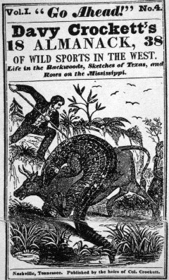
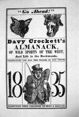
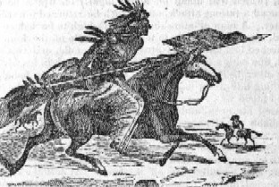
| The early Crockett Almanacs are illustrated with unsigned images closely tied to the subject matter of the story. They are consistently straightforward in their presentation of the topic and generally employ a simple composition. One example is the cover of the 1835 Almanac that emphasizes the year while also providing a hint of the animal stories and humor included in the issue. Another illustration from that issue features a graceful image of a Native American on horseback that effectively uses lines that trace the contours of the human and animal figures to create a sense of depth.
|
|
|
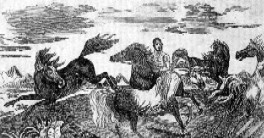
Images from the 1837 Almanac illustrate the simplified compositions and expressive use of line in the early woodcuts. The waving lines used to create the effect of clouds in the image “Catching Wild Horses” create arcs that echo the curving lines of the prancing ponies, adding energy to the composition. At the same time, the curving lines of the horses’ backs create a fluid circle surrounding the central figure, focusing our attention on the human element in this scene. The inclusion of foreground details of foliage create a visual anchor and show the artist’s skill in creating a variety of line and shade.
|
|
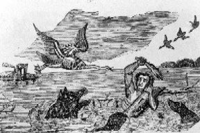
| In the image of Crockett crossing the river, the lines are rigidly horizontal except for those on Crockett, where the artist has used lines that follow the contour of his body to give the impression of depth. The scale of the riverboat is inconsistent with the other elements considering their proximity, and the simplified use of line shows the inconsistency of quality in early Crockett Almanac woodcuts.
|
|
|
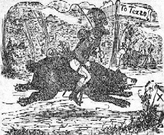
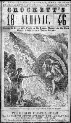
In the 1840s, the images remain unsigned and somewhat inconsistent in quality, but the use of line and composition also reflect a new aggressiveness and exaggeration in keeping with the nature of the stories they illustrate. For example, the 1845 image “Riding to Texas” exhibits the same simplified composition with a shallow space and expressive use of line seen in earlier works, while the cover for the next year features a complex composition involving foreshortening of the figure’s leg as it extends from the wound-up alligator. The 1846 cover image is composed of flowing, elegant lines and subtle tones and shades that contrast sharply with the simplified image from the year before and belie the impossibility of the scene depicted.
|
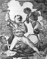
| By 1848, in the image “The Death of Crockett,” the artist has created a dynamic composition of dramatic diagonals and billowing clouds that both silhouette and frame the central figures. While the 1846 cover uses flowing lines to express the energy of Niagara Falls, the overall composition remains surprisingly static. This contrasts sharply with the 1848 image where Crockett is frozen in time, a tragic moment preserved in stop-action. The stage-like exaggeration of Crockett’s pose seems over-acted, and the complex interplay of overlapping arms, legs and weapons visually overwhelm the viewer. In 1845 we chuckle at the galloping bear, the following year we marvel along with the soldiers in the image at Crockett driving his alligator up Niagara Falls, but in 1848 we are thrust head-long into the battle - no longer readers or spectators, but participants in the overwrought drama.
|
|

|
Images from the 1850s continue to reflect the nature of the stories, varying from elegant to bizarre. The 1851 almanac included the story of Davy’s sister who, out of Christian charity, “walked the frozen bank of Columby river, fifteen days, livin on nothing but pure hope to hunt up the fifteen lost men in Col. Fremont’s caravan, that was scattered by a snow storm.” Again in this image the lines are simple, elegant and graceful, perhaps in reference to the beautiful spirit of the female rescuer. Despite the drama of the tale, this image shows a scene of quiet restraint. Davy’s sister strikes a gentle pose, holding the lost man’s hand as though she is standing by a sickbed.
|
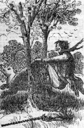
| Conversely, in the 1856 almanac, readers were treated to the story “A Bear-Thief and a Thief Laid Bare: or Crockett Splitting Up A Grizzly.” In this amazing tale, a bear walks up to Crockett’s camp on its hind legs, takes the reins of Crockett’s horse in its paws and proceeds to steal the horse. In the process of chasing the bear to retrieve his horse, Crockett manages to skin the bear as it runs between two trees. The harshness of the lines and the cartoon-like nature of Crockett’s face create a laughable image, despite the admirable handling of landscape and trees. In this images, then, the artists placed even the ridiculous story into more realistic settings, with the result that the action seems all the more outlandish.
|
|
Artists and the Crockett Almanacs
Several well-known artists and/or engravers lent their skills to the creation of the Crockett Almanacs. Operating as both illustrator and engraver, it was common for one man to design the image or “cut” and another artist to engrave it for publication. Three artists have been specifically identified as working on the Crockett Almanacs.
William Croome (1790 - 1860) was both illustration artist and engraver. A prolific artist, Croome contributed to numerous publications including A Manual of the Ornithology of the United States and Canada (1832), The Pictorial History of the American Navy (1845), A Pictorial Geography of the World (1847) and many others. For the 1839 Crockett Almanac at least three of the illustrations are by Croome, engraved by Alonzo Hartwell. In the 1842 Crockett Almanac Croome designed the title page.
Alonzo Hartwell (1805-1873), prominent illustrator in Boston publishing circles, primarily did wood engraving from 1826-1851 when he turned to portrait painting. Among the many publications he illustrated are A History of the United States of America (1833), Robert Merry’s Museum (1841-42-43), Chimes, Rhymes and Jingles or Mother Goose’s Songs (1845) and The Boston Almanac for the Year 1850. In the 1839 Crockett Almanac Hartwell engraved at least three images after designs by Croome. Hartwell also engraved the title page and six other full-page cuts for the Crockett Almanac for 1842. The title cut was after a design by William Croome.
Joseph B. Howell(dates unknown), a native of Pennsylvania, was active in Philadelphia from 1855-65 and whose works were exhibited at the Pennsylvania Academy of Fine Art. In the 1856 Crockett Almanac several images have Howell’s signature with the note “H. Sebald sc.” Indicating they were engraved by Hugo Sebald.
John H. Manning (born c.1820), an engraver and designer in Boston, was one of the artists for Gleason’s (later published as Ballou’s) Pictorial Drawing Room Companion. Among his other illustration credits are Turner’s Comic Almanac (1845), Narrative of the United States Exploring Expedition (1845), and Boy’s Own Book of Fun (1847). Manning’s work for the Crockett Almanacs included three illustrations in the 1840 edition, and in the 1841 edition Manning designed four cuts that were then engraved by Hartwell.
Hugo Sebald(dates unknown) was a wood engraver and designer of Philadelphia who is linked with the Crockett Almanacs through the reference to his having engraved the Howell images for the 1856 edition.
|
Go Ahead! Learn More! Visit the Bibliography and Web Resources!
|