More Rules of Visualization
 Let the data speak for itself Let the data speak for itself

 example from The Dos And Donts Of Infographic Design
A chart is more memorable than a table of numbers
Compare writing of numbers to: using graphics

 example from The Dos And Donts Of Infographic Design
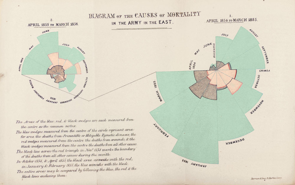
Frame the reference: plotting numbers together can create the context
Ensure that your axes are clear
Avoid confusing images
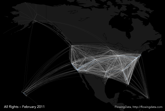
Rich data, high visual impact
Use color carefully (see Material Pallate)
- Don't use multiple colors to represent the same kinds of data ... Use different shades of the same color.
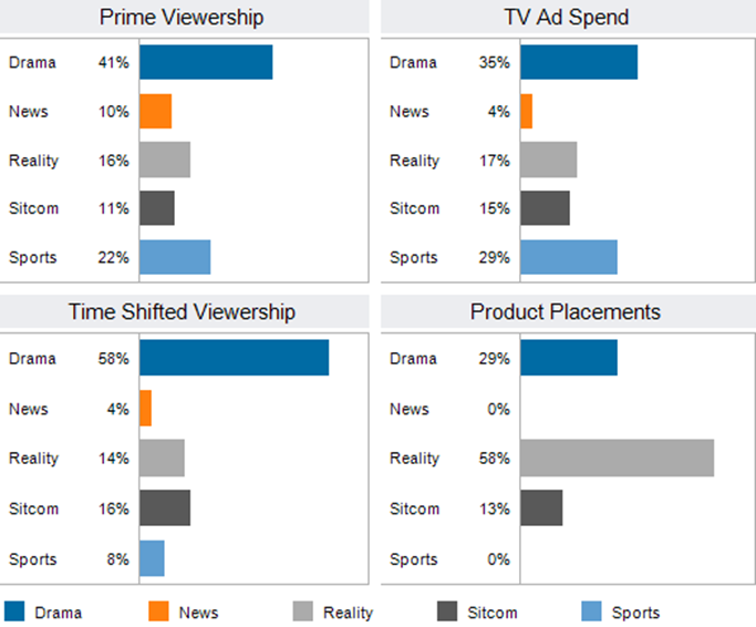
Borrowed from: Audience Report
- Don't use colors on the opposite side of the color wheel in multiple bar chart
- Use bright colors to emphasize important information

- Mute color on non-highlighted segments
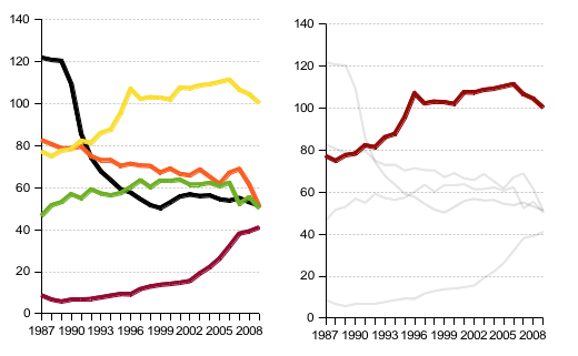
Image borrowed from Doing Lines Charts Right
- Don't set the scale with alternating light and dark colors in the middle of the scale
- Avoid thematic representation of colors (holidays)
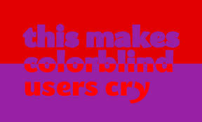
- Don't use red to represent positive values
- Arrange data from lightest to darkest (or vice versa)

- Convert colors to gray scale to see if there is enough contrast
 
- Ensure high contrast in representation of different data
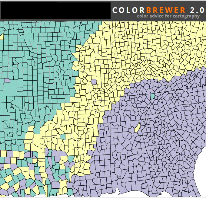
Image From Color Brewer
Keeping the Attention
See Tips for creating effective and engaging data visualizations
- Avoid shading the bars (in bar charts) with patterns
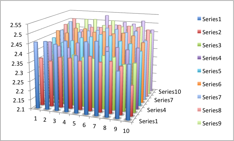
- Avoid 3-D bars
- Use lines that convey appropriate detail: too thin can fade into background while too thick hides details
- Avoid too many lines in one graph; mute some to allow emphasis of the "point"
- Avoid broken bars in vertical bar charts, except when one is quite different (about 3 times) from other values
Fonts and words
- Set type in black
- Use as few fonts and font styles as possible; do not use bold and italic together
- Do not let font overwhelm the visualization
- Label directly on chart elements (instead of a legend)
- Label change points or important points on the grid
Trends
- Highlight Outliers
Borrowed from Data Remixed
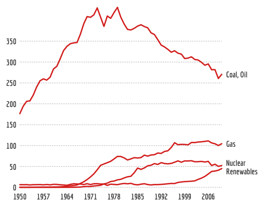
- Use the full axes to represent the trend correctly
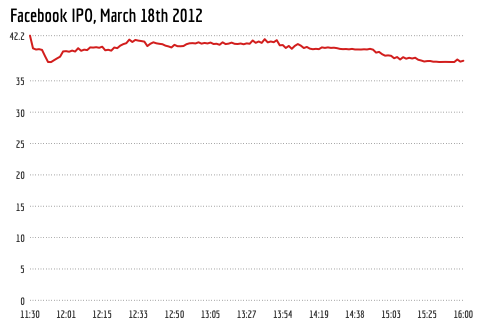
Borrowed from Doing the Line Chart Right
- Do not mix apples and oranges: do not chart two uncorrelated series on one graph
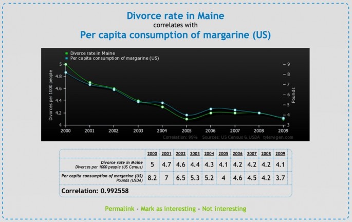
- It is appropriate to use the same axes for two data sets if they behave in tandem
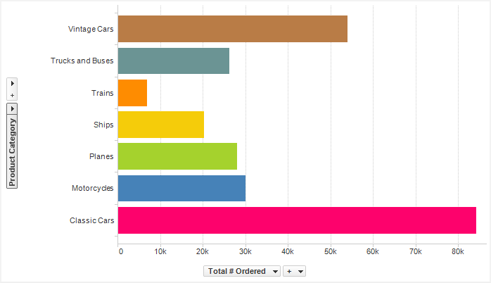
- Horizontal bars must be in numeric order (largest at top; most recent at top)
- Send the right impact: do you want to show performance in actual value or in percentage change
Multiple ways to show time
Histograms
Line Charts
Movement of bubble charts as shown in Visualizing empires decline
Temporal Charts
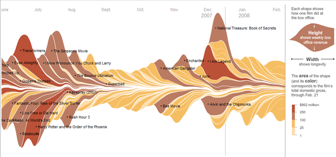
Borrowed from New York Times
Sankey diagrams (shows flows)
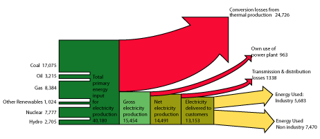
Borrowed from: FOE Diagram: Up in Smoke
Spray Charts
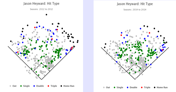
Borrowed from: Fan Graphs
Grid Lines
- Use thin grid lines after every three to five entries (wider tables require more lines)
- Small tables do not need any grid lines
- Place chart in a table to convey main message
- Alternate shading of rows in table can be distracting
Pictograms (metriglypics)
- Pictograms should only be used when comparing a few data series
- Pictograms should be simple
- Avoid using different pictograms; use shading to represent different categories
Basic Elements of Design
| UM-St. Louis
Home Page
| College
of
Business Page | IS
Home Page | DSS
Home Page |
Page Owner: Professor
Sauter
(Vicki.Sauter@umsl.edu)
© Vicki L. Sauter. All rights reserved.
|