RECAP
Hamming It Down in Japan
By SETH STEVENSON

 he
Nippon-Ham Fighters are the ''Fighters,'' not the ''Ham Fighters.''
That is, Nippon-Ham is the owner of the team, which plays in the Nippon
Professional Baseball league in Japan. It's simply a bit of misfortune
that the organization's full name suggests lunch-meat gladiators. he
Nippon-Ham Fighters are the ''Fighters,'' not the ''Ham Fighters.''
That is, Nippon-Ham is the owner of the team, which plays in the Nippon
Professional Baseball league in Japan. It's simply a bit of misfortune
that the organization's full name suggests lunch-meat gladiators.
As
it happens, the Fighters are no strangers to misfortune. They are
perennial doormats in Japan's major league. They have been awful for
decades on end, with exceedingly rare exceptions, and -- as if to
highlight their ineptitude -- they play in the same city and stadium as
the legendary Yomiuri Giants. While the Giants draw 50,000 passionate
fans to the Tokyo Dome for each game, the Fighters are lucky to get
10,000. One Japanese sports executive says the team's image is so
dismal that the team ''could actually devalue the ham brand.''
Is it any wonder Fighters management ached for a change? So
this off-season the team is moving far, far away from Tokyo and the
Giants in order to establish a brand-new identity on the northern
island of Hokkaido. There the Fighters will play in the Sapporo Dome --
a gorgeous modern stadium named for Hokkaido's largest city -- and they
won't even have to share it with another baseball team.
New city, new stadium, with luck some new fans -- perfect time
for a total image overhaul. And that includes the most important
element of all, the key to any brand and, above all, to any sports
franchise: the logo.
The fighters drafted SMJ, a Tokyo sports-marketing firm, to make
over the image. According to SMJ, this is a first; previously, all
logo-design work for N.P.B. teams had been handled by Japanese ad
agencies.
SMJ's first step was to conduct a survey. It found that
Japanese baseball fans regard the Fighters as a bunch of losers, and
Fighters fans as a bigger bunch of losers. SMJ concluded that the new
brand image should evoke Hokkaido more than Nippon-Ham. Just as
American teams are identified with cities instead of ownership groups,
the Fighters would position themselves as Hokkaido natives first and
ham beneficiaries last. As one executive on the design team puts it:
''Brand strategy flushed out early the fact that ham didn't offer us
anything in terms of communicating fighting spirit.''
Then again, neither did the Fighters' existing mark -- ''mark''
being industryspeak for logo. It was a cartoon knight in a helmet with
its metal visor down, waving a baseball bat like a sword. N.P.B. teams
favor childish, cartoony logos that no self-respecting teenager, or
adult, would ever wear. (And they don't: N.P.B. licensing revenues are
meager, while Major League Baseball licensing is growing at more than
40 percent a year in Japan.) Even the Yomiuri Giants symbolize
themselves with a cartoon rabbit known as the Giabbit.
But the Fighters longed for a logo that wouldn't look out of
place on a team in Major League Baseball. A logo that would not only
sell T-shirts but maybe even also win some newfound respect. So SMJ
brought in SME, its New York-based partner, to design a new set of
marks. SME has made logos and uniforms for hundreds of pro and college
teams in every major sport for the likes of the Seattle Mariners, the
New Jersey Nets and the New York Rangers.
SME designers suggested four possible graphic directions.
 Traditional Heraldic
The knight theme remains as a heraldic badge. The fighter himself
is far less cartoony. And the central image is the letter F. In logo
design, a particular element is said to ''win'' if it's the center of
attention. Here, the F wins. But other text plays an interesting role
as well: notice that ''Hokkaido'' gets nearly equal billing to
''Nippon-Ham.''
 Contemporary Heraldic Contemporary Heraldic
Another heraldic badge, this time modernized and less overt. The
''retaining,'' or framing, shape of the design suggests both a shield
and home plate. The knight has disappeared entirely, and the images are
the island of Hokkaido, a baseball and mountains. The emphasis shifts
from a ''fighter'' to geography. Again, text -- the large ''Fighters''
-- dominates the logo. SME's internal notes claim that this option
''uses innovative color combinations for modern coolness, attracting
young fans'' and that the mark ''promises high entertainment.''
 Contemporary Baseball Contemporary Baseball
The retaining shape suggests a baseball diamond; the typeface
conveys a fast and forward-leaning feel. Even more than before, the
text wins, with ''NHF'' the focal point. SME says it was looking to
design ''for the 31st Major League team'' with this mark. ''These
uniforms have to walk on the field and compete with the Seattle
Mariners, the Florida Marlins and so on.'' SME feels this is where
sports-mark design is at right now.
 Baseball Forward Baseball Forward
SME expects this look to be the next step for M.L.B. teams. The
retaining shape is again a diamond, but this time the angles, edges and
''shards'' create ''energy and dynamism'' and ''a bold brand
statement.'' Neither text nor figure wins; abstract geometry powers the
mark. With the Sapporo Dome arguably the most high-tech stadium in the
world, SME saw a chance to couple a unique, forward-looking stadium
with a unique, forward-looking mark.
In general, the trend in sports marks has been away from figure
and detail toward text and abstraction. Look at the mark of the
N.H.L.'s Florida Panthers. As an SME designer explains, the 90's style
was all three-dimensional detail, coming at an observer with claws and
teeth in carefully illustrated ferocity. In contrast, marks today are
minimalist: clean typefaces and conceptual shapes carry the logo. Words
replace humanoid and animal characters. SME's design for the Nets is
essentially a triangle with the word ''Nets'' inside, but the triangle
has depth and weight and leans forward, while the text appears to
expand.
The goal here is to sell some hats and T-shirts, but there's
more to it than that. Logos, whether symbols of a sports franchise or a
multinational corporation, must encapsulate the entire organizational
philosophy, mission and brand identity in a single diminutive graphic.
As SME puts it, a mark ''must be able to communicate in the 1.2 seconds
it flashes on-screen.'' Success is when every emotion the consumer
feels for a brand becomes inextricably woven into that one image. Stamp
a logo on a T-shirt, and suddenly that T-shirt lets you wear all those
emotions. Works for endorsements too: put the logo on a box of cereal
and somehow the cereal tastes like those emotions. That's Branding 101.
Not that weaving a brand's emotions into a mark is easy to do
from scratch. The Green Bay Packers logo, nothing more than a G in a
circle, might not make it out of a design shop today. But the narrative
of the franchise has, over time, endowed the mark with so much passion
and tradition that its value is nearly immeasurable.
Before SME redesigned the Seattle Mariners logo, the team
ranked 26th in the league in merchandise sales. The logo, a simple M in
gold and blue, ''had nothing to do with the region, or the team, or
anything,'' says an SME executive. ''We added a compass rose, a
baseball and Pacific Northwest green.'' In one year, the team moved to
seventh in merchandise sales. More important, the Mariners seemed to
establish a whole new relationship with both their fans and the region.
Perhaps it is just a coincidence, but the team started winning too.
Upon seeing the opening round of designs, Fighters management
immediately ruled out all human figures. They didn't want an actual
fighter to represent the team, preferring instead the notion of
fighting spirit. This eliminated the Traditional Heraldic mark. And the
futuristic looks of Contemporary Baseball and Baseball Forward, which
SME's designers favored, were a bit too radical for the Fighters. It
was enough of a risk to break from the hidebound style of N.P.B. logos.
 That
left Contemporary Heraldic. But the Fighters felt the silhouette of
Hokkaido and the mountains were ''too obvious.'' They wanted something
modern, classy, conservative and right in line with current M.L.B.
logos. That
left Contemporary Heraldic. But the Fighters felt the silhouette of
Hokkaido and the mountains were ''too obvious.'' They wanted something
modern, classy, conservative and right in line with current M.L.B.
logos.
SME came back with a mark not unlike the one for the Mariners:
a baseball centered on a set of points. But while the Mariners logo is
a compass rose, the Fighters' is a seven-pointed star -- a longtime
symbol of Hokkaido's early pioneer settlers. (Sapporo beer uses a star
logo as well.) The ''Fighters'' text wins, but the prominent baseball
leaves no doubt what this brand is about. The corporate name is
present, but regional identity is heavily emphasized.
Because this was the rare redesign case where even the palette
was up for grabs, SMJ conducted additional surveys to find a color
scheme that fit Hokkaido. Locals suggested that a rich gold tone might
bring to mind several Hokkaido themes at once: the bare earth of the
hills, the tasty skin of Hokkaido potatoes, the bubbly hue of a glass
of Sapporo beer. The star was colored gold.
Finally, the mark was subjected to the all-important ''squint
test'' -- how readable would it be up in the corner of a small TV
screen? The test revealed the word ''Hokkaido'' was a tad too tiny and
needed a larger typeface and more space to spread out. Done and done.

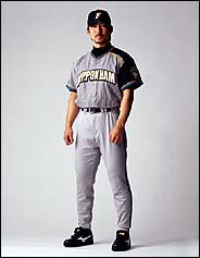
The last steps were new uniforms and a new mascot. To give the
jerseys a fresh style, SME went for an asymmetrical look, with a single
black shoulder. ''The black really makes it pop,'' says one SME
executive. It's a look SME thinks is unique in world baseball.
The previous mascot was an odd-looking, bright pink bird named
Fighty, so misshapen that it hardly resembled a bird at all. One SME
worker, in a moment of confusion, thought it was meant to be a ham. So
SME sketched several new options. One was a giant lobster with a glove
on its left claw. (Hokkaido is known for its seafood.) Another showed
an anthropomorphized narwhal -- you know, the sea creature with the
horn coming out of its head. SME would not even release this sketch,
apparently out of embarrassment, but I recall seeing a small baseball
cap set jauntily beside the narwhal's horn.
In the end, the Fighters chose a bear. But not just any bear.
It's an attitudinal bear, the kind of mascot that ''taunts'' the
opponent. As of this writing, the mascot outfit is undergoing special
tailoring -- modifications that will let its wearer sprint around the
stands and even do back flips. The bear has not yet received a name.
Seth Stevenson last wrote for the magazine about refugee housing. Save 50% off home delivery of The Times
|